A complete UX and UI redesign for the dashboard of SkillCore – a web platform for fan base/community engagement. The product was previously built through an incremental approach, so it was time to rethink it through a user-centered perspective of research and validation.
The company stated that admin users were frequently not coming back to their spaces after the sign-up and onboarding phases, which could reveal problems with the dashboard navigation.
2. Listening to the users
Extracting information
Knowing that the platform had not enough admin users in order to approach them quantitatively, I decided to interview them.
Interviews: questions and demonstrations
• I interviewed 5 admin users, trying to contemplate the wider amplitude of use (people can use the platform for different contexts) • The interviews consisted of open questions about the dashboard that could lead to demonstrations. If a certain problem was of a specific practical order, I asked the user to walk me through it by sharing her/his screen. • The interviews were conducted over a period of 2 weeks.
3. The pains
A matter of territories and monsters
After using synthesizing methods for decomposing and consolidating information, I could understand the main users pains and its contexts: 1. Users were getting “geographically” lost between different scopes and environments 2. Users were feeling overwhelmed by options while none of them was solving specific problems 3. Users reported a feeling of losing control over the dashboard
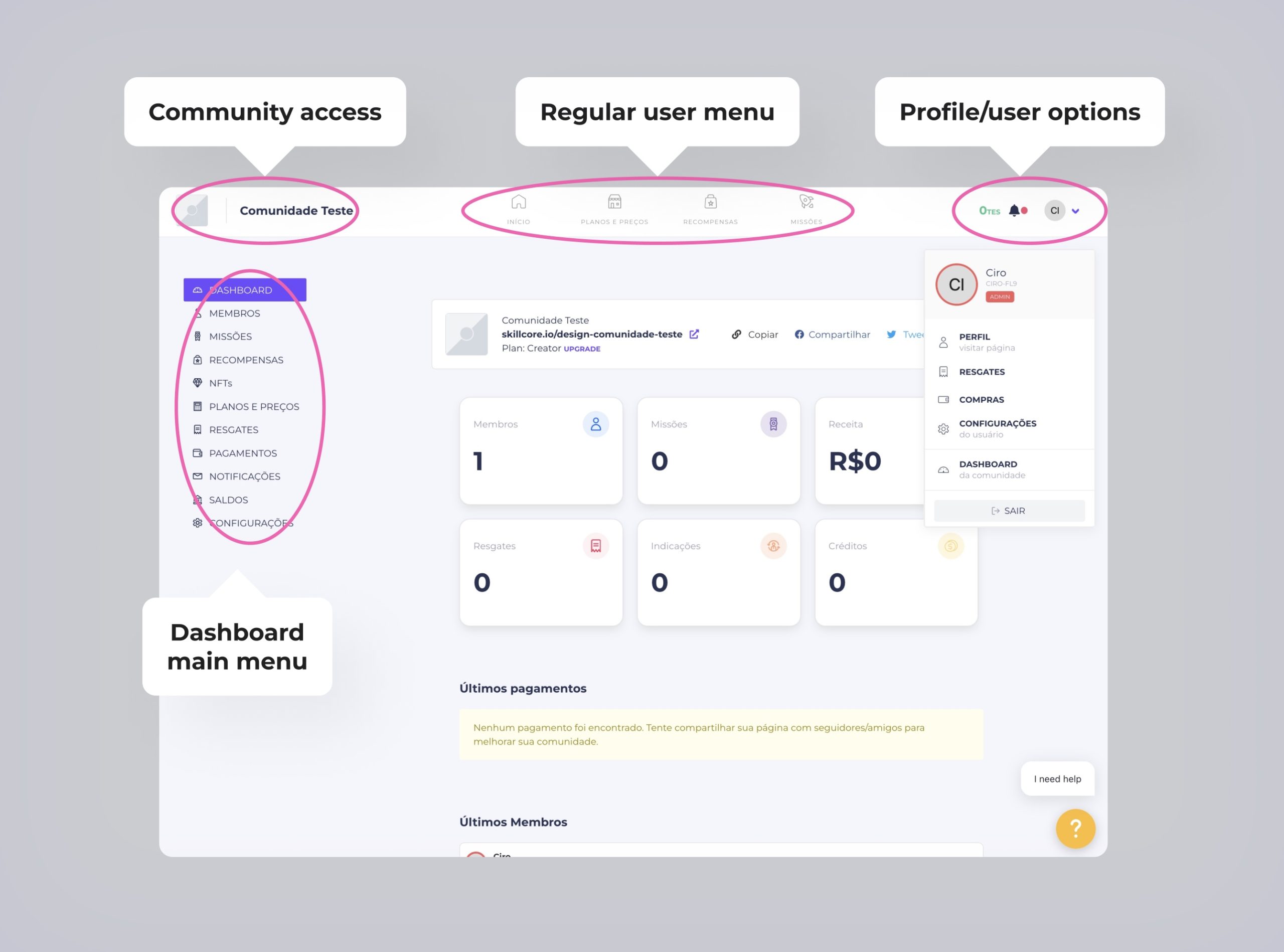
2.1 Lost between boundaries
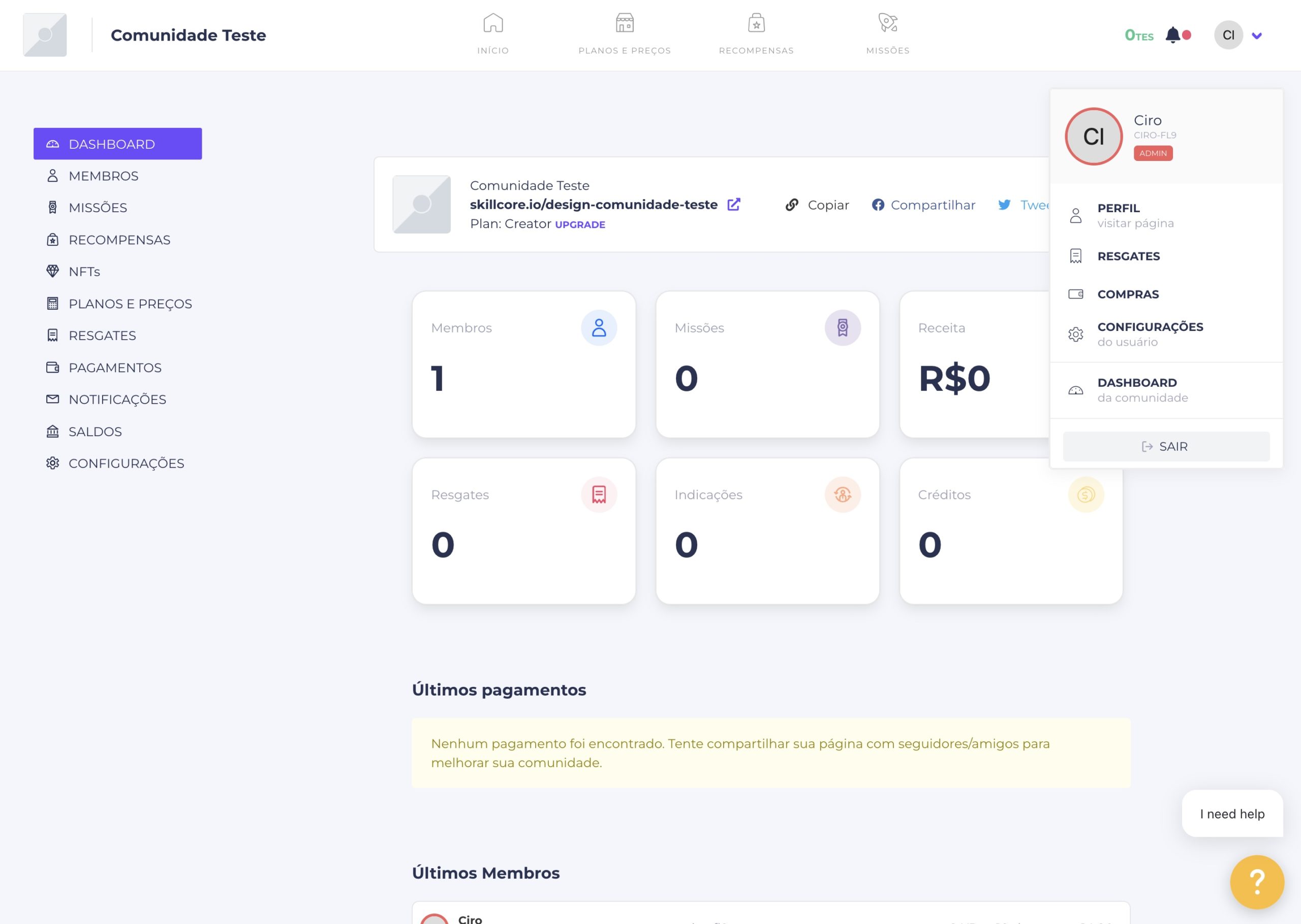
• The dashboard interface was displaying three different menus, all of them relative to different scopes: one menu was for the user as a regular user, the other one was for the user as an admin user and the third one was for the user as the community being managed. • Besides the user scopes, it was also not clear the difference between the two main environments where the user could navigate back and forth: the dashboard itself and the community page. • All of these diffuse boundaries between scopes and environments were making the admin user feel lost.
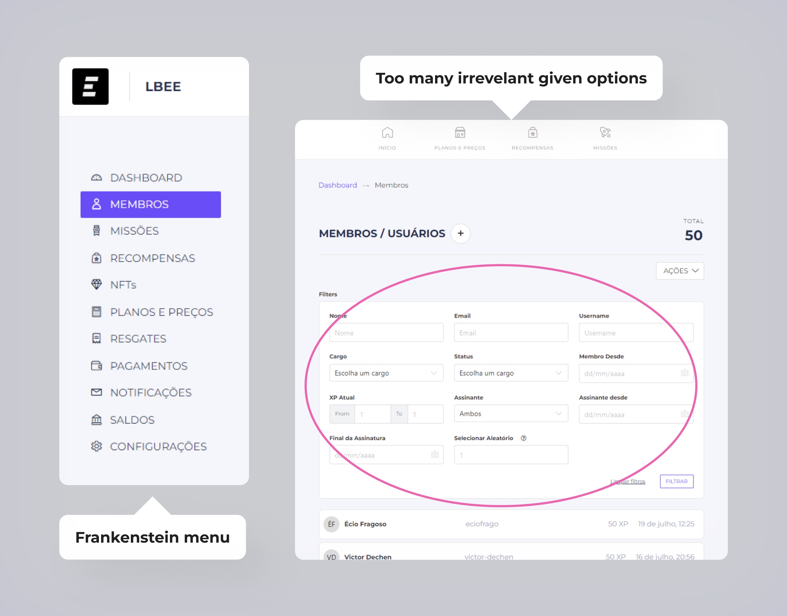
2.2 The frankenstein interface
• The dashboard menu was not only too long, but also seemed to be arranged randomly. The options were not organized in affinities. • The given options on a given page could be overwhelming for the user. The listing pages, for example, displayed all the filter options at once prior to the list • I could find that these problems were result of incremental updates over incremental updates focused on solve isolated demands
2.3 Losing control
All of the diffuse boundaries, overwhelming options and random arrangements were making the user feel simply lost in the dashboard, not understanding how to navigate the interface.
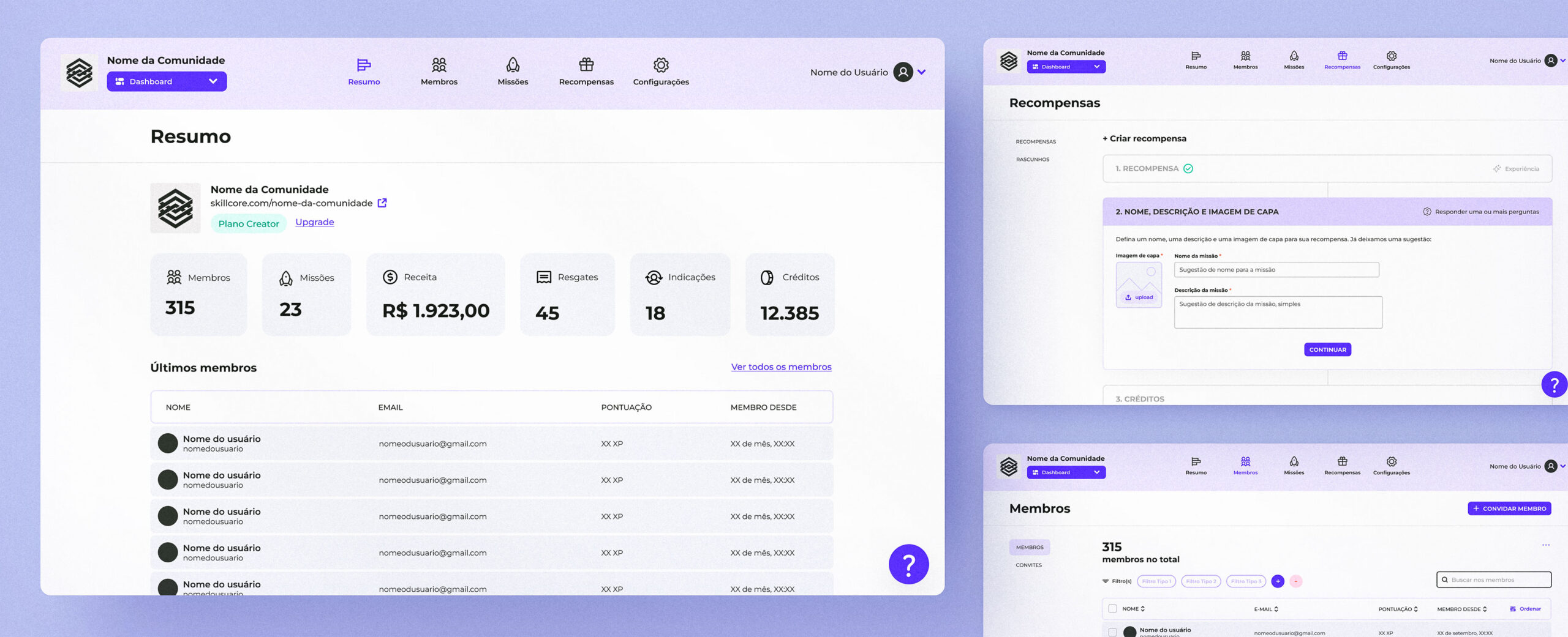
4. Re-designing
From UX to UI
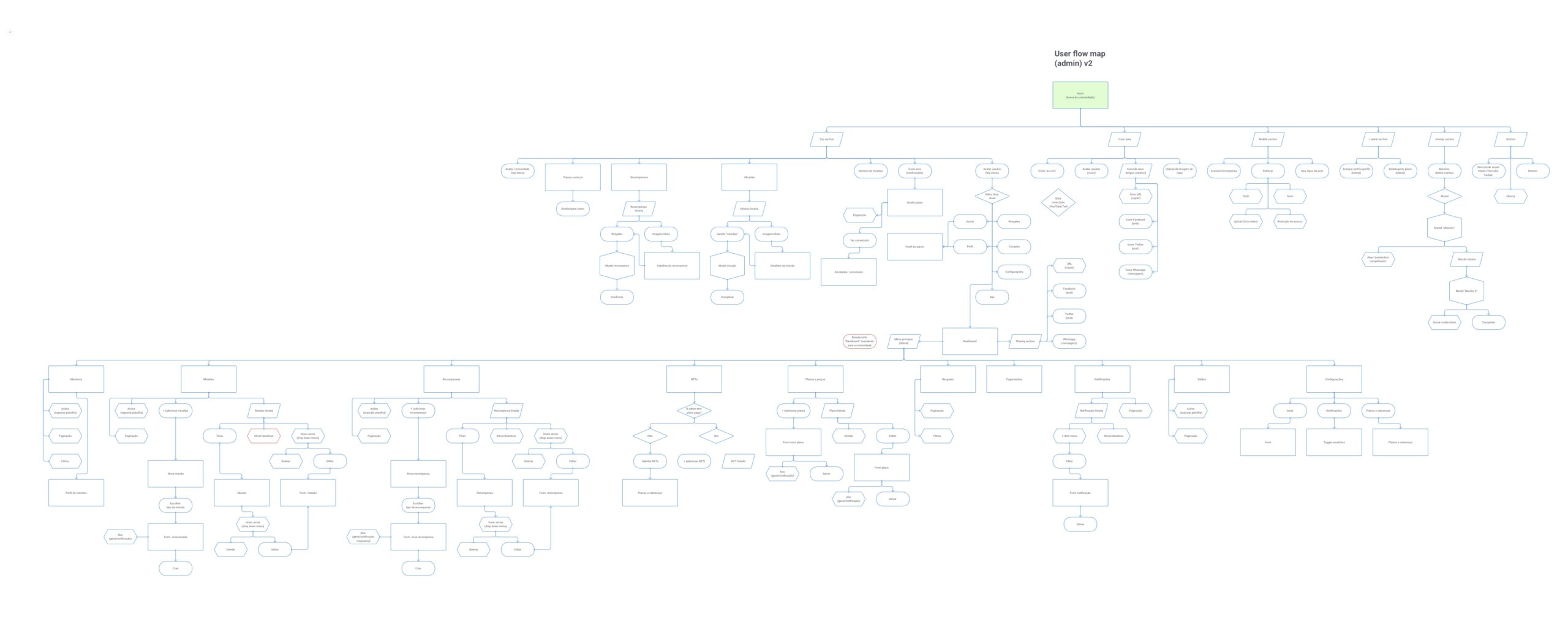
First, a collaborative map
I gathered the entire startup team and presented the users pains and barriers. We, then, started to draw a new user flow map trying to solve the problems during sequential meetings.
Visual directions: some resemblence + mininalism + material design
I had relative freedom in proposing the visual direction for the new dashboard. It was expected, though, that I didn’t present something radically different, preferably inheriting the previous design system to an extent. I’ve chosen a minimalist orientation, taking the Material Design as an influence.
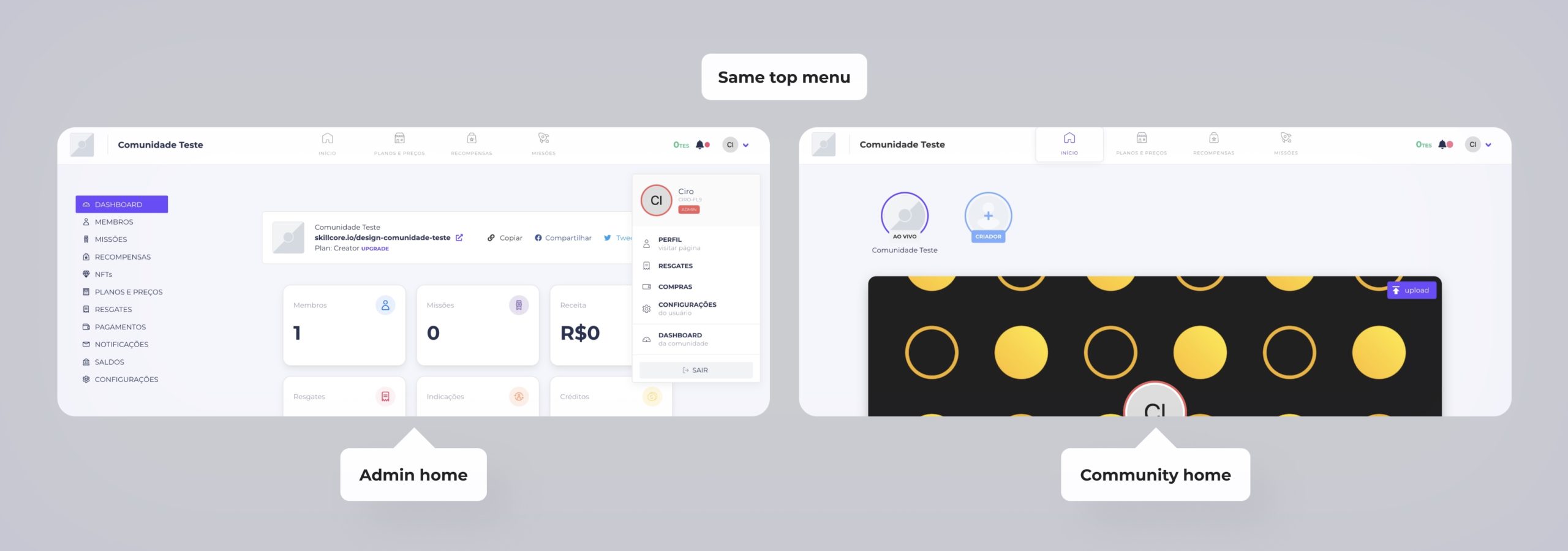
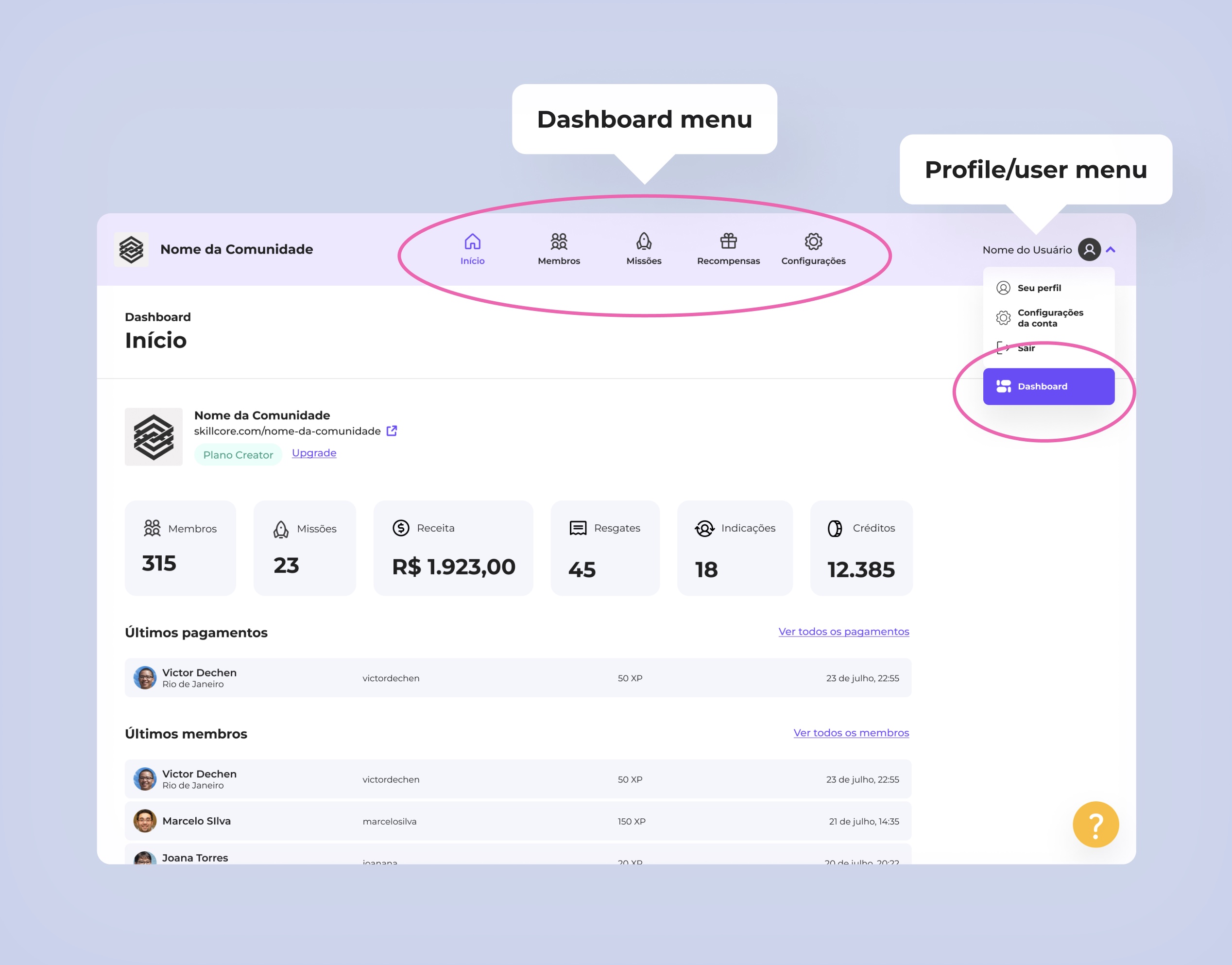
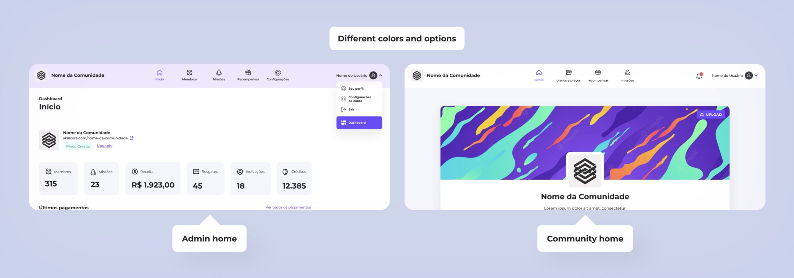
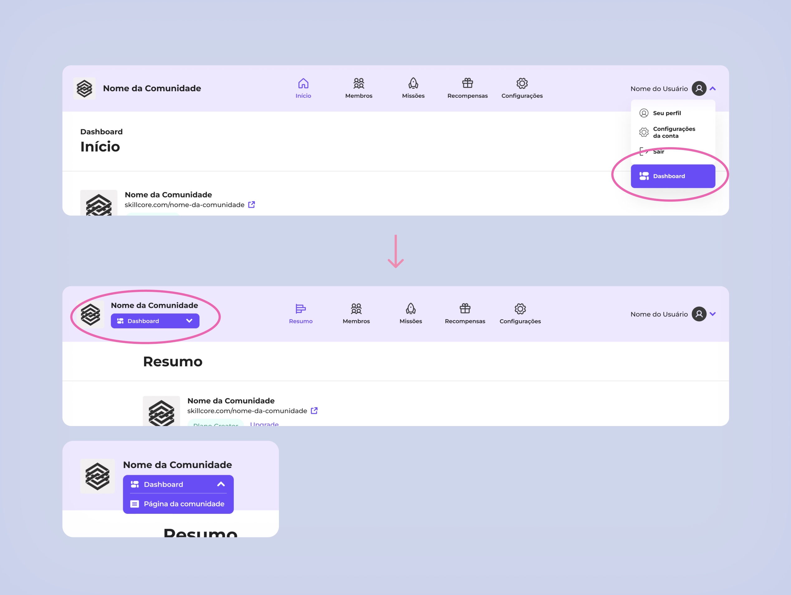
You are here: clearer boundaries between scopes and environments
• Now the dashboard has a unique color environment, setting it apart from the other side of the platform (the community page) • The sidebar menu was removed, becoming the only displayed menu at the top • Also, the option “dashboard” on the user menu was strongly flagged
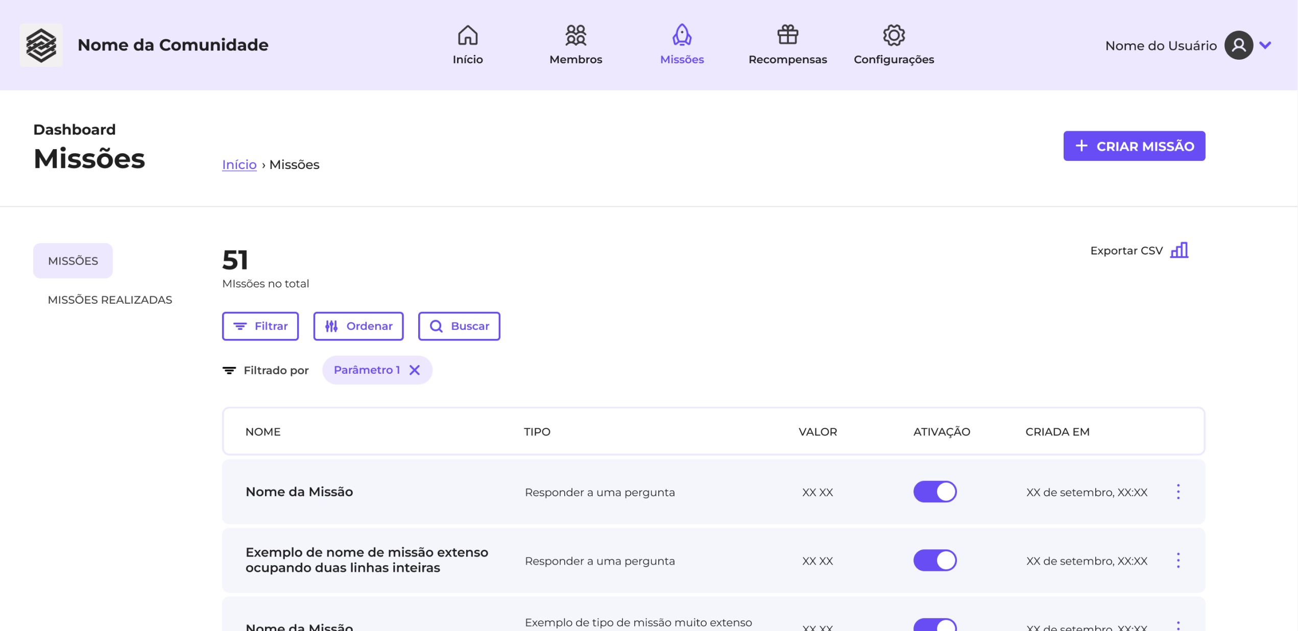
Let’s get minimal: organizing options, reducing clutter
• The menu was reduced, some options were collapsed into one, according to affinities. • Whenever it was possible to reduce the amount of displayed information without compromising the understanding and safety for the user, I did it • All of this process was conducted in collaboration with the startup team
Heuristics, we do!
As many of them were not taken in consideration in the first dashboard version, applying the Nielsen’s Heuristics was essential for this redesign. Some examples of what changed:
• The tasks progress is now tracked • The user can always find a way out when needed • Consistency was applied to the entire dashboard environment • A simpler and more direct writing replaced the previous one
prototyping
5. Testing
Time for validation and refinement
I did 6 monitored usability tests using the prototype, basically watching admin users complete or react to simple tasks. A tabulation of the outcomes showed some common problems:
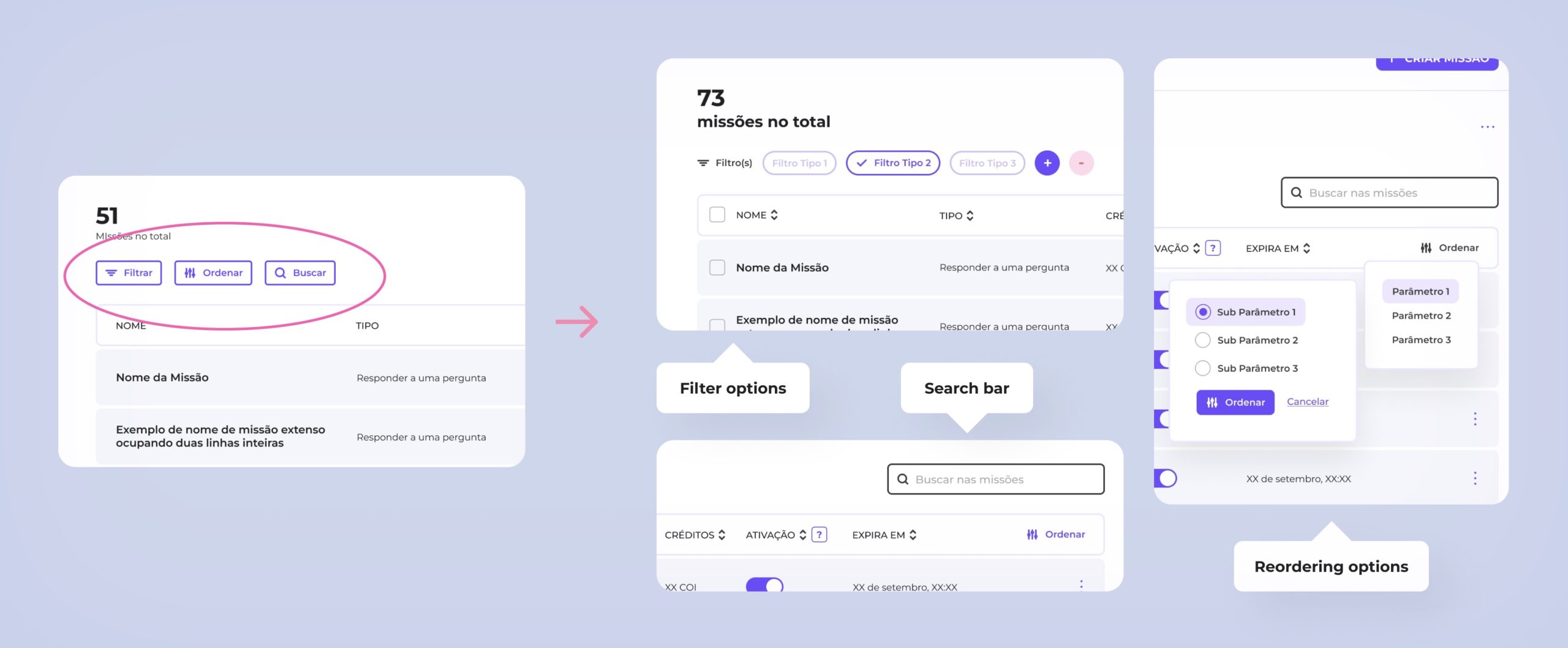
• Despite feeling more aware of the scopes, the users still had a degree of uncertainty about it • They demonstrated need for more flexibility during some journeys (such as setting up missions) • The filtering and reordering for the listing sessions were not clear enough
6. Implementing changes
last touches
Flagging territories even better
Now the user can see and choose between the two main environments without having to go access hidden menus
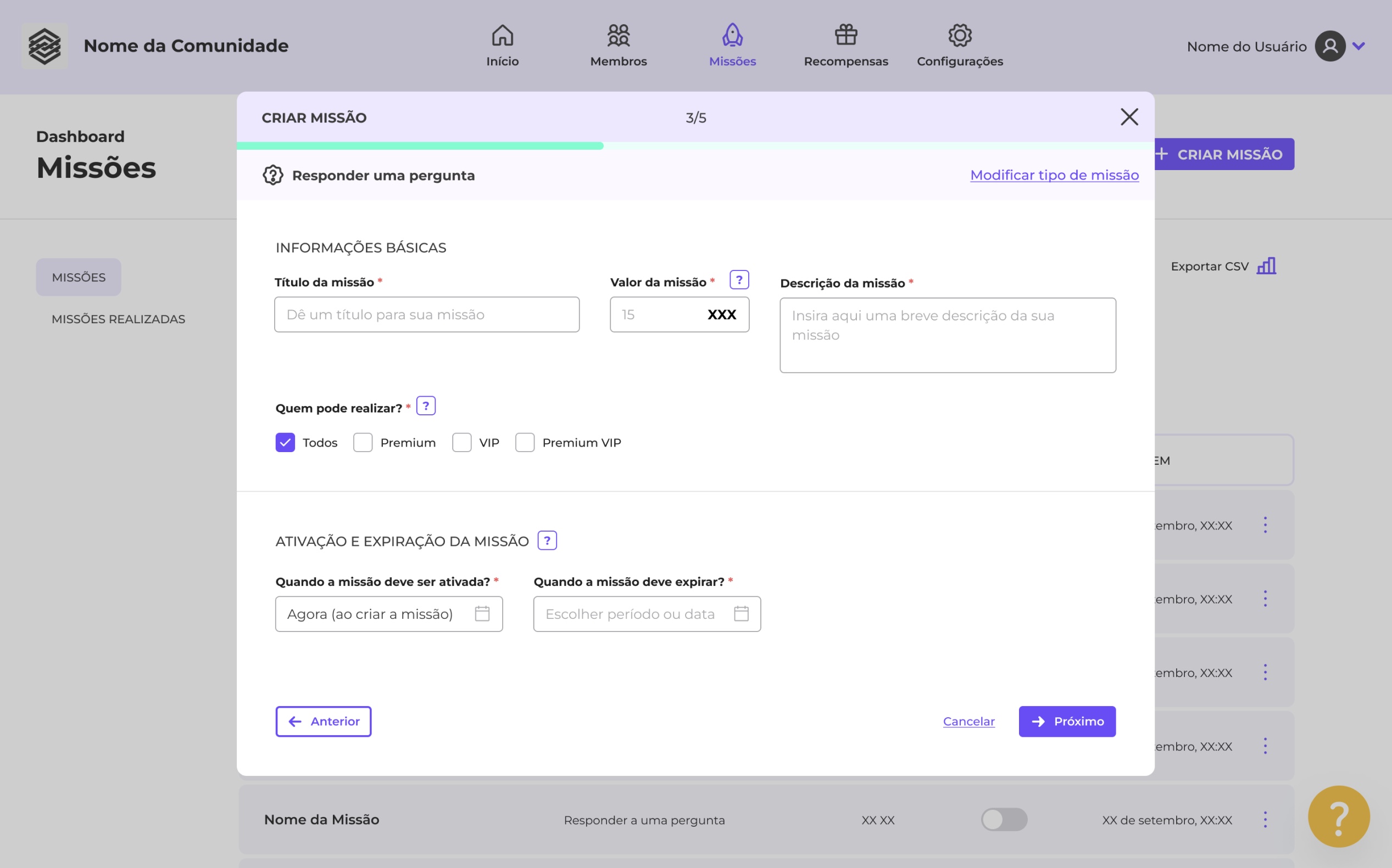
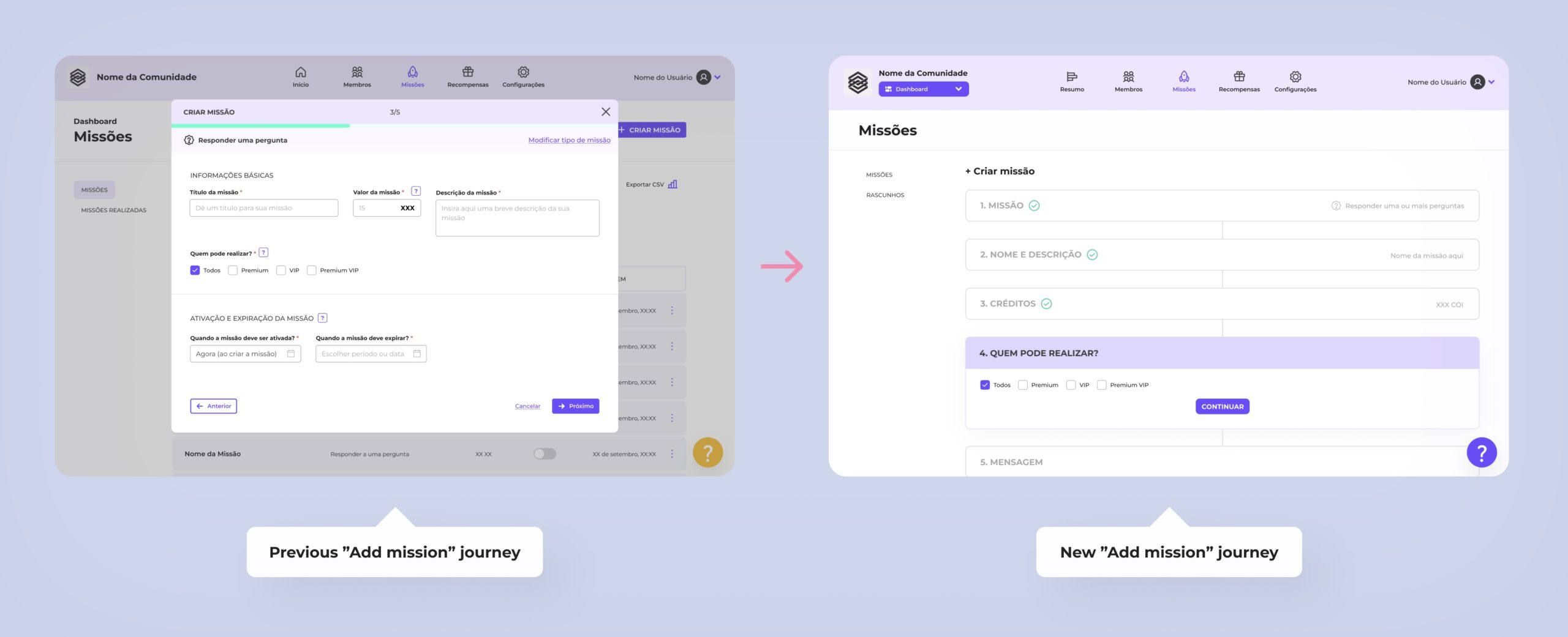
More structured and flexible journeys
Now the main journeys (“Add mission”, “Add reward” and “Invite members”) are more structured and happen vertically instead of through limited modal windows. That way is possible to fit information better and adjust to users demands.
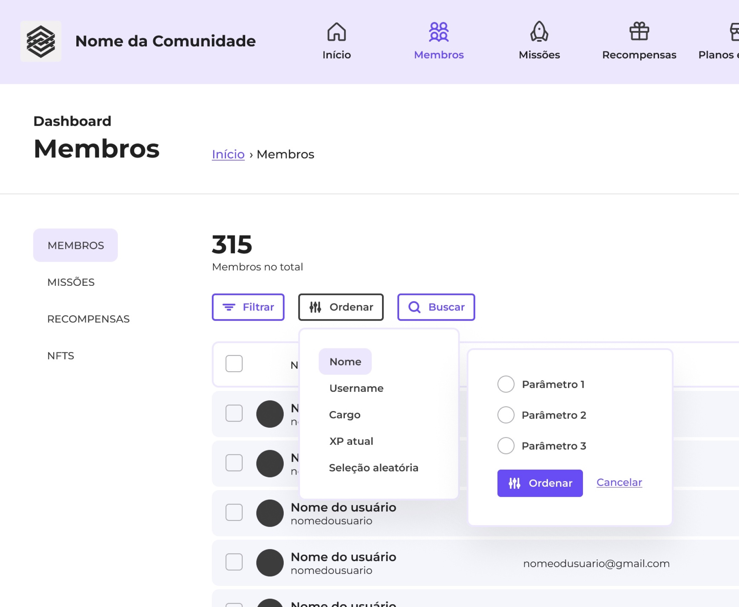
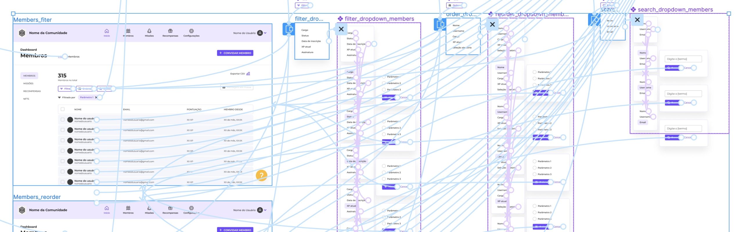
Filtering options within easy reach
Now the commands for filtering, reordering or searching lists are placed in different areas and happen through distinct mechanisms. Some common filters are already listed, although not activated. That way the user doesn’t get confused and can overlap them naturally.